

Appearance settings
Customize Edmissa with your workspace logo, colors, typography, layout, theme mode, and advanced appearance settings.
Appearance settings control how Edmissa looks for users in your workspace. Use this page to add agency branding, adjust light and dark theme colors, choose fonts, tune layout styles, and manage advanced appearance configuration.
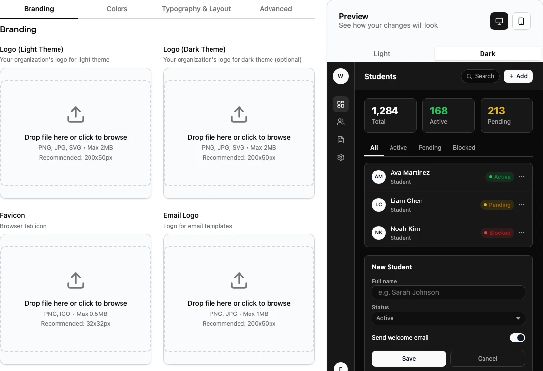
The page is labeled Appearance Settings. The visible tabs are Branding, Colors, Typography & Layout, and Advanced.
When to Use Appearance Settings
Use Appearance settings when your agency needs to:
- Upload or replace the workspace logo.
- Add a separate logo for dark theme.
- Add a favicon for browser tabs.
- Add an email logo for Edmissa email templates.
- Add a login page background image.
- Set light and dark theme colors.
- Choose fonts, base font size, spacing, button style, and input style.
- Choose whether users see light theme, dark theme, or both.
- Export, import, or reset appearance settings.
Appearance settings are for the visual identity of the workspace. They do not control users, roles, locations, student fields, application workflows, notifications, or document collection rules.
Before You Start
Prepare the branding details before editing Appearance settings.
| Item | Why it matters |
|---|---|
| Logo for light theme | Used when Edmissa is shown in light theme. |
| Logo for dark theme | Optional. Helps the logo stay readable in dark theme. |
| Favicon | Shows a small agency icon in browser tabs. |
| Email logo | Used in supported email templates. |
| Background image | Optional login page background image. |
| Brand colors | Helps admins choose consistent light and dark theme palettes. |
| Font and layout preferences | Keeps Edmissa readable and comfortable for daily use. |
You also need permission to manage workspace settings. If the page is locked or you cannot save changes, ask an admin to review your access. Appearance may also depend on branding access for your workspace.
Open Appearance Settings
- Open Settings.
- Select Appearance.
- Review the Appearance Settings page.
The direct route is /t/settings/appearance.
The page header includes:
| Action | What it does |
|---|---|
| Light mode | Switches the active theme setting to light mode. |
| Dark mode | Switches the active theme setting to dark mode. |
| Reset | Discards unsaved changes and restores the last saved values on the page. |
| Save Changes | Saves non-branding appearance changes. |
Use Save Changes after changing colors, typography, layout, theme mode, background display style, or custom CSS.
Branding asset uploads and removals save through their own upload and remove actions. You do not need to select Save Changes after a logo, favicon, email logo, or background image upload completes.
Use the Preview Panel
The right side of the page shows Preview with the description See how your changes will look.
Use the preview before saving:
| Preview control | What to check |
|---|---|
| Desktop | Review how the theme looks on a wider workspace layout. |
| Mobile | Review how the theme looks on a narrow screen. |
| Light | Preview the light theme colors. |
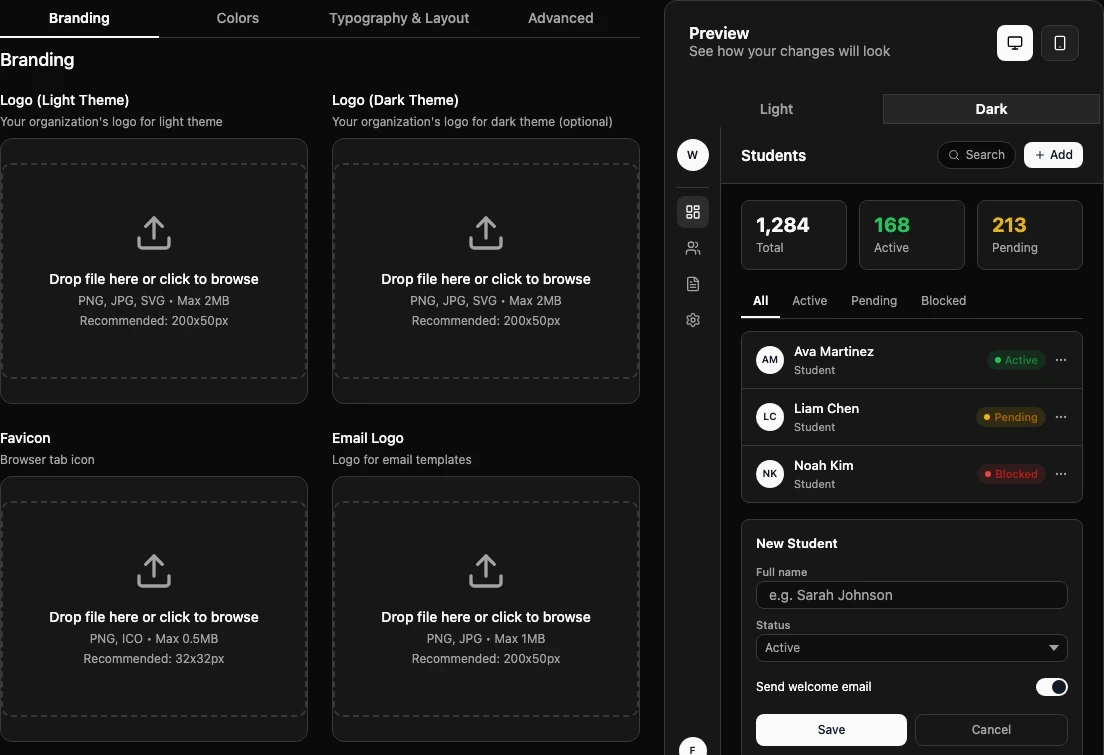
| Dark | Preview the dark theme colors. |
The preview helps you catch color contrast, logo readability, font size, input style, and button style issues before users see the changes.
Branding Tab
Use Branding to upload the visual assets for the workspace.
| Setting | Purpose | Accepted formats | Limit | Recommended size |
|---|---|---|---|---|
| Logo (Light Theme) | Main logo for light theme. | PNG, JPG, SVG | 2 MB | 200x50px |
| Logo (Dark Theme) | Optional logo for dark theme. | PNG, JPG, SVG | 2 MB | 200x50px |
| Favicon | Browser tab icon. | PNG, ICO | 0.5 MB | 32x32px |
| Email Logo | Logo for email templates. | PNG, JPG | 1 MB | 200x50px |
| Background Image | Login page background. | PNG, JPG, JPEG | 5 MB | 1920x1080px |
To upload an asset:
- Open Branding.
- Find the asset you want to update.
- Drop the file into the upload area or click to browse.
- Wait for the upload to finish.
- Review the preview shown in the asset card.
When an upload succeeds, Edmissa shows an uploaded state and saves the asset. If the file is too large or has the wrong format, Edmissa shows an upload error. Choose a supported file and try again.
To remove an uploaded asset, select the remove icon on the asset card, then confirm Remove.
Logo Preview
When a light or dark logo exists, the page shows Logo Preview with separate light theme and dark theme previews.
The dark theme logo is optional. If you do not upload one, Edmissa uses the light theme logo in dark theme.
Background Display Style
After you upload a background image, Edmissa shows Background Display Style. Choose how the image appears on the login page.
| Option | What it does |
|---|---|
| Cover - Fill entire screen | Fills the available area. Parts of the image may be cropped. |
| Contain - Fit within screen | Fits the whole image inside the area. Empty space may remain. |
| Repeat - Tile pattern | Repeats the image as a pattern. |
| Center - Original size, centered | Keeps the original size and centers the image. |
| Stretch - Fill and stretch | Stretches the image to fill the area. The image may distort. |
Changing Background Display Style requires Save Changes.
Colors Tab
Use Colors to control the light and dark theme palettes.
The tab has two sections:
| Section | What it controls |
|---|---|
| Light Theme Palette | Colors used when Edmissa is in light theme. |
| Dark Theme Palette | Colors used when Edmissa is in dark theme. |
Each section provides preset palettes. Select a preset to start with a complete set of colors.
To edit individual colors, open Fine-tune individual colors.
Light theme color fields include:
- Primary Color
- Secondary Color
- Accent Color
- Text Primary Color
- Text Secondary Color
- Background Color
- Surface Color
- Border Color
Dark theme color fields include:
- Dark Primary Color
- Dark Secondary Color
- Dark Accent Color
- Dark Text Primary Color
- Dark Text Secondary Color
- Dark Background Color
- Dark Surface Color
- Dark Border Color
Use the preview panel to check both themes before saving. Colors are applied to Edmissa interface elements across the workspace after you select Save Changes.
Typography & Layout Tab
Use Typography & Layout to adjust reading comfort and component style.
Typography
| Setting | Options |
|---|---|
| Primary Font | Inter, Roboto, Open Sans, Lato, Montserrat, Poppins, Raleway, Source Sans Pro, Nunito, Work Sans |
| Secondary Font | Inter, Roboto, Open Sans, Lato, Montserrat, Poppins, Raleway, Source Sans Pro, Nunito, Work Sans |
| Base Font Size | Small (14px), Medium (15px), Default (16px), Large (17px), Extra Large (18px) |
The primary font is the main font users see in Edmissa. The secondary font is available for supported secondary text areas.
Layout & Components
| Setting | Options |
|---|---|
| Border Radius | Square (0px), Small (4px), Default (8px), Large (12px), Extra Large (16px) |
| Spacing | Compact, Normal, Comfortable |
| Button Style | Rounded, Square, Pill |
| Input Style | Outlined, Filled, Underlined |
Use these settings carefully. Very small spacing, very large text, or unusual component styles can make daily work harder to scan.
Theme Mode
Under Theme Mode, set Available Themes.
| Option | What users see |
|---|---|
| Light Theme Only | Users only see the light theme. |
| Dark Theme Only | Users only see the dark theme. |
| Both (User Selectable) | Users can toggle between light and dark themes. |
Select Save Changes after updating typography, layout, or theme mode.
Advanced Tab
Use Advanced only when you need to manage CSS or move appearance settings between workspaces.
Custom CSS
The Custom CSS section includes Custom Styles.
Custom CSS can break Edmissa page layouts and behavior if it is not tested carefully. Only add CSS when your team knows how to test and support it. Edmissa sanitizes or rejects unsafe CSS.
After editing Custom Styles, select Save Changes.
Configuration Management
The Configuration Management section includes:
| Action | What it does |
|---|---|
| Export | Downloads current appearance settings as a JSON file. |
| Import | Loads appearance settings from a JSON file. |
| Reset | Restores appearance settings to default values after confirmation. |
Exports include appearance configuration such as colors, typography, layout, theme mode, background display style, and custom CSS. Asset files such as logos, favicon, email logo, and background image are not included in the exported JSON.
When you reset to defaults, Edmissa preserves branding assets by default. Select Also reset branding assets (logos, favicon, background image) if you want the reset to remove those assets too.
Recommended First Pass
For a new Edmissa workspace, set Appearance after General Settings and before inviting the full team.
- Upload Logo (Light Theme).
- Upload Logo (Dark Theme) if the light logo is hard to read on dark backgrounds.
- Upload Favicon and Email Logo if your agency has approved assets.
- Choose a light theme palette and fine-tune brand colors.
- Choose a dark theme palette if your workspace uses dark theme.
- Review Typography & Layout and keep the defaults unless the agency has a clear brand requirement.
- Use the preview panel in desktop, mobile, light, and dark modes.
- Select Save Changes for non-branding changes.
- Ask a second admin to review the workspace after saving.
Troubleshooting
| Issue | What to check |
|---|---|
| Upload fails | Confirm the file type and file size match the asset requirements. |
| Logo looks unclear | Try a wider logo near 200x50px and use a transparent background when possible. |
| Dark theme logo is hard to read | Upload Logo (Dark Theme) instead of relying on the light theme logo. |
| Background image looks cropped | Try Contain - Fit within screen or Center - Original size, centered. |
| Colors are hard to read | Use the preview panel and adjust text, background, surface, and border colors together. |
| Changes disappear before saving | You may have selected Reset, which discards unsaved page changes. |
| Reset removed more than expected | Check whether Also reset branding assets (logos, favicon, background image) was selected. |