

Field Configuration
Understand the settings available for each field type.
Field configuration controls how a field behaves after the basic details are set. The available settings depend on the field type.
Basic Tab Settings
The student field wizard starts with Basic.
| Setting | What it controls |
|---|---|
| Field Category | The group of field types, such as Basic Fields or Compound Fields. |
| Field Type | The input type users will work with. |
| Display Label | The name users see in forms and views. |
| Field Name | The system key generated from the label. Review it before saving. |
| Help Text | A short instruction shown to users. |
| Field Group | The group where the field belongs. |
| Required Field | Whether the value must be provided before the relevant form can be completed. |
Choose the field type carefully. Once a field is in use, changing its type can break existing data and connected workflows.
Simple Field Configuration
Most basic student fields show:
| Setting | Use it for |
|---|---|
| Placeholder Text | Hint text shown before a value is entered. |
| Default Value | A value that is filled automatically for new records. |
Application fields include Placeholder Text and Help Text in the main creation dialog.
Option Fields
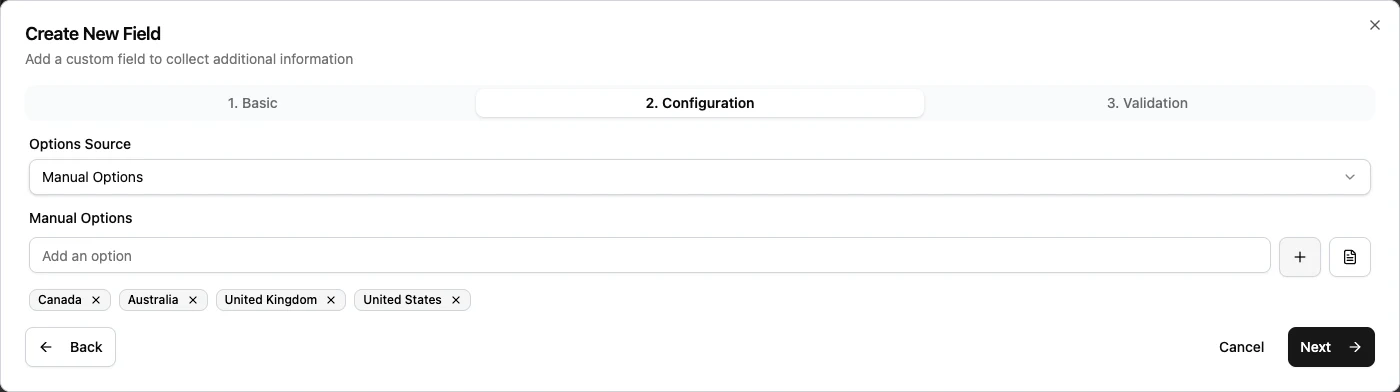
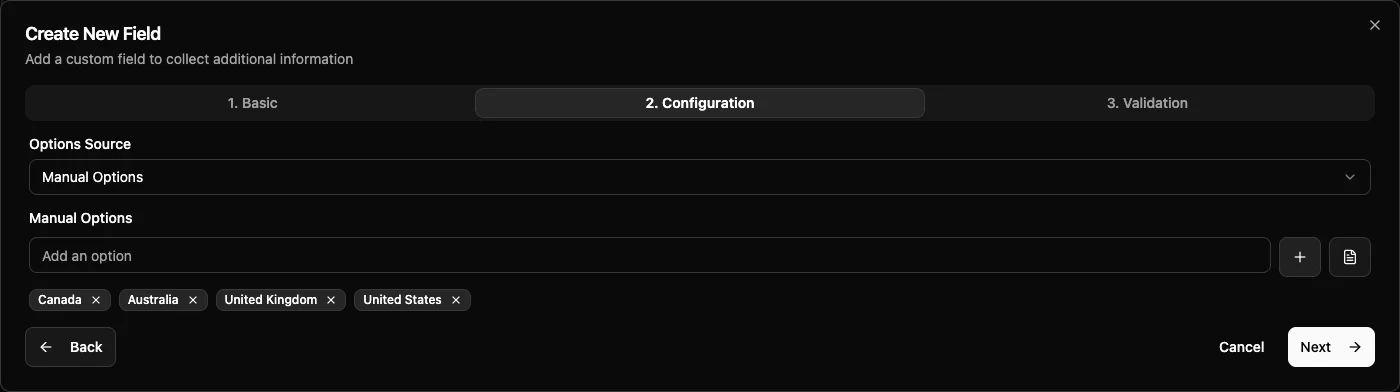
Dropdown, Multi Select, and Radio Buttons use options.
| Option source | Use it for |
|---|---|
| Manual Options | Enter a short list directly in the field settings. |
| Dataset | Use a managed list and optionally allow or exclude specific items. |
| Lead Sources | Use the values from Lead Sources settings. This is available for student fields. |
Manual options are best for small lists that rarely change. Datasets are better for longer lists, shared lists, or lists that need central management.
Currency Fields
Currency fields can be configured with:
| Setting | What it controls |
|---|---|
| Currency Source | Use the location default currency or choose one specific currency. |
| Show Currency Symbol | Show or hide the currency symbol. |
| Allow Negative Values | Decide whether users can enter amounts below zero. |
Use location default currency when different branches work in different currencies. Use one specific currency when the field always refers to the same currency.
Phone Fields
Phone fields can be configured with:
| Setting | What it controls |
|---|---|
| Allowed Countries | Allow all countries, specific countries, or one country only. |
| Phone Type Restriction | Accept mobile numbers, landline numbers, or both. |
| Default Country | Preselect the country when the field is empty. |
| Show Country Code | Show values such as +971. |
| Show Country Flag | Show or hide the country flag. |
| Custom Placeholder | Override the hint text shown in the empty phone field. |
Use country restrictions when the agency only accepts phone numbers from a specific operating region.
Address Fields
Address fields are structured fields. They can include Street Address, Street Address 2, City, State or Province, Postal Code, and Country.
Address configuration can control:
| Setting | What it controls |
|---|---|
| Subfield visibility | Which address parts users see. |
| Subfield requirement | Which visible address parts users must fill. |
| Country options | Allow all countries, restrict to selected countries, or lock to one country. |
| City input type | Use free text or a dropdown list. |
| State input type | Use free text or a dropdown list. |
| Custom labels | Rename address parts for your region. |
| Custom placeholders | Change the hint text for each address part. |
For dropdown city or state values, admins can import several options at once.
File And Image Upload Fields
File Upload and Image Upload fields use Document Type settings.
The selected Document Type controls file rules such as accepted formats and maximum file size. Set up document types before adding upload fields.
Compound And Custom Groups
Field Group and Repeating Group fields can use either:
| Mode | Use it for |
|---|---|
| Template | Use a prebuilt group. This is the recommended mode when the template matches the need. |
| Custom Subfields | Build your own group with subfields. |
Custom subfields can use Text, Number, Date, Date & Time, Time, Dropdown, Checkbox, Email, Phone, URL, Text Area, and Currency.
After a group is created, existing subfield keys and types should be treated as locked because they protect existing data. Labels and guidance can still be improved.
Repeating Behavior
Repeating Field and Repeating Group settings can include:
| Setting | What it controls |
|---|---|
| Minimum Instances | The fewest entries users must add. |
| Maximum Instances | The most entries users can add. |
| Add Button Label | The label on the add action. |
| Remove Button Label | The label on the remove action. |
| Empty State Text | Text shown before any entry is added. |
| Instance Label Pattern | How each repeated entry is named. |
| Allow Reordering | Whether users can drag entries into a new order. |
| Collapse Instances | Whether entries can open and close like an accordion. |
| Collapsed By Default | Whether entries start closed. |
Repeating Field also asks for the base field type. The base type can be Text Input, Number, Email, Phone, URL, Date, Date & Time, Time, Text Area, Currency, Dropdown, or Multi Select.
Related Guides
| Guide | Use it for |
|---|---|
| Field categories and types | Choose the correct field type. |
| Field types | Review each individual field type before configuring it. |
| Validation | Add required and value rules. |
| Display configuration | Decide where the field appears after it exists. |